How much do you trust a weathercaster’s predictions?
Maybe you don’t trust them at all, or maybe you have a preference for one source, which you feel usually is more correct than others. But can you make an objective statement on how good their forecasts are?
At Parkopedia we predict the availability of parking spaces, throughout the year, for hundreds of thousands of locations around the world. We ask ourselves the same question, and naturally get asked the same by our clients and partners: how do we measurably and objectively demonstrate the quality of these predictions?
Statistics and Machine Learning are nowadays widely used to try to predict the future. Single-valued forecasts try to predict exact outcomes like the expected value of Pound Sterling in US Dollars for tomorrow, or the predicted temperature at your holiday destination next weekend. The quality of this kind of predictions is relatively straightforward to judge: you note down the predicted value, wait until the time that the prediction was made for, record the actual value you observe, and finally you take the difference of the two values to decide how good the prediction was. For example, if two forecasters predict that the temperature tomorrow at noon will be 18 and 22 degrees respectively, and the next day you record an actual temperature of 21 degrees, the second forecaster has obviously performed better than the first with an error of only 1 degree versus 3 degrees.
For another class of predictions it is a bit less straightforward how to get a definite performance metric, namely those that predict the probability of something happening. An example in weather forecasting is the probability of it raining or not at some future time. The most relevant example for us is the probability that a parking space is available at your destination at the planned time of arrival. Humans are notoriously bad at dealing with uncertainty and probabilities, not helped by the possibly ambiguous language surrounding them. As the Harvard Business Review shows there is no real consensus on how probable something is when we say it will ‘probably’ happen, or how much more likely those events are compared to those that ‘maybe’ will happen.
Probabilities in concrete numbers
It is important to talk about probabilities in terms of concrete numbers first. They are commonly expressed as a number between 0 and 1, where 0 means the predicted event will certainly not happen, 1 means it guaranteed will happen, and 0.5 for instance means a 50:50 chance. Equivalently we can also refer to these in percentages, so that they are between 0% and 100% and a 50:50 chance is then, well, 50%. Now the question becomes: given a prediction of X% of something to happen, I wait and observe what actually happens, what is a binary outcome of the predicted event either happening or not, then can I make a good judgment of the quality of the prediction?
The main problem is that a probability is never a guarantee (unless the prediction really is a chance of 0% or 100%). If the prediction for rain was only 10% and based on that you went out without an umbrella, but you still got soaked in a massive shower, then of course you’re not very happy with the forecaster, but she could always say that you were just unlucky; her prediction did leave the possibility of this happening with a chance of 1 in 10. From this single sample a forecaster who gave a prediction of 90% may seem superior, but it could be that out of the next 9 times that the same predictions were made it won’t rain at all, which would vindicate the first forecaster. This gives an indication of the first insight on being able to test the quality of a probabilistic forecaster: one needs to collect a larger amount of samples to know whether the predicted probabilities properly reflect overall frequencies of something happening, in contrast to our very first examples of temperature and price where a single observation already gives some measure of accuracy.
The exact meaning of probabilities can get quite philosophical, but going from the initial intuition above, many people arrive at something like the following when trying to put into words some condition on what constitutes ‘good’ probabilistic forecasts:
Out of all the times one predicts an event to happen with a probability of X%, that event should happen X% out of those times.
So if you take all the days for which somebody predicted there to be a 30% chance of rain, over say a whole year, then the expectation is that it actually did rain on average 3 out of 10 of those days. If this average is higher or lower, then we know the predictions are suboptimal at least in some sense. This idea is called calibration, and a forecaster for whom the probabilities and actual observed frequencies align is said to be ‘well calibrated’.
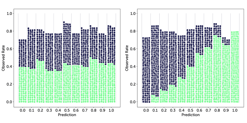
It will be helpful to visualise this idea. First, assume we only predict a finite number of different probability values from 0 to 1, e.g. up to one decimal: 0.0, 0.1, …, 1.0, which gives us 11 values. Next, we will make a number of predictions and corresponding observations of the actual outcomes. Every time we make a positive observation (it did indeed rain, or we were able to find a parking space), we take a green ball and put it in a bin corresponding to the predicted probability for that event. For a negative observation we take a dark blue.
Here are some possible examples outcomes for two different forecasters:
 The first forecaster seems very random: no matter what they predict, the outcome seems to be close to 50:50 throughout. The second forecaster is much better calibrated: the higher the probability that they provided, the more often the event indeed did happen.
We can make this concrete and measurable with a little bit of math. First, assume we only predict K different probability values from 0 to 1, e.g. up to one decimal: 0.0, 0.1, …, 1.0, for K = 11. Next, we will make N predictions and corresponding observations of the actual outcomes. We group these by the K different prediction values, which we will denote with fk where f0 = 0.0 and fK = f10 = 1.0, and then determine the ratio of times within those groups that the predicted event actually happened, which we will denote with ōk for group k corresponding to prediction value fk. With all this in place we can state the calibration idea a bit more formally: we expect the observed ratio ōk to be as close to the predicted probability/ratio fk as possible for each group k. We can take the difference between the two to measure this, square it so we treat over and underestimates the same, sum it over all groups (weighted by the number of predictions made in that group, nk, to put more emphasis on the largest groups), and finally average over all N observations to arrive at a final objective measure of the notion of ‘calibration’:
 This is a so-called loss, which means higher values are worse, and a score of 0 indicates perfect calibration.
We can extend our earlier figures a bit to make the parts of this loss visible. Below we draw in light blue the line of perfect calibration, where the predicted rate fk is exactly equal to the observed rate ōk, and in dark grey the actual observed rates. The lengths of the vertical lines connecting these are then equal to the difference fk - ōk in the equation above.
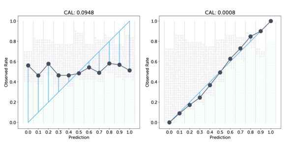
The differences for the first, more random forecaster are much larger and indeed this results in a worse (higher) calibration score.
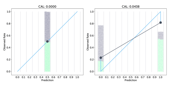
Badly calibrated forecasts are no good, but it is important to note that well calibrated predictions don’t guarantee useful predictions. To see this, let’s take a look at Bergen, Norway, where on average it rains a whopping 239 out of 365 days a year(!), which is about 65% of the days. Based on this, a weathercaster could decide to predict a chance of rain of 65% for every day of the year. He would have only one group of predictions with fk = 0.65, with an observed rate over the year of ōk = 0.65, resulting in a calibration score of 0 and him boasting that he is perfectly calibrated, but of course that is no use to anybody. Similarly, predicting a fixed chance of 5% of being able to find a parking space in Rome anytime anywhere may be correct, but doesn’t help you decide where to actually look for parking.
The first image below shows this effect for an example where the prediction is always 0.5 for a situation where indeed overall the chance of a positive event is 50%: the single blue dot is bang on the perfect calibration line, and the calibration loss is 0, but the predictions are worthless. Another possible extreme, shown in the second image, is a forecaster who always either predicts 0 or 1, so is always 100% certain, even though in this case he may be wrong about 1 in 5 times. His calibration loss is non-zero, but arguably his predictions are much more useful.
This shows that you don’t just want your forecaster to be calibrated, but also to give varying predictions, that are ideally more towards the extremes of 0% and 100%. This idea is also called resolution. The best forecaster would achieve perfect resolution by only outputting chances of 0% or 100%, while still being perfectly calibrated, which means the observation rates are exactly 0.0 and 1.0 respectively.
One way to put resolution is that we want the observed rate for each bin, ōk, to be distinct from the overall observed rate over all examples, ō. This leads us to using the difference between the two, summed and weighted over all bins just like we did for calibration, arriving at a very similar equation for this score:
 In contrast to calibration, for this score a higher result is better. So to get a single score we can just subtract the resolution from the calibration: CAL - RES, which again is a loss where lower is better. The following shows this combined picture for our last two examples above:
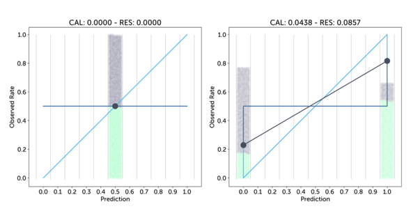
The horizontal dark blue line shows the average observed rate over all samples, 0.5 in both cases, and the vertical lines between that line and the per-bin, grey observation rates show the contribution to the resolution score of that bin. This shows that the first forecaster has no resolution, whereas the resolution lines of the second, more confident forecaster outweigh the calibration losses. This means the combined score of the second is less than that of the first (−0.0419 versus 0.0), and we have arrived at an objective, quantitative measure validating our intuition that the second forecaster is better.
To wrap up, it turns out that the combination of CAL and RES, with a small additional term, results in another simple and nicely elegant formulation:

The extra uncertainty term (UNC) is defined as ō(1 - ō), which basically is a baseline loss that is maximum when the overall observed rate is 50%, and incorporates explicitly that it is harder to get a good score when there is a lot of uncertainty about the event you want to predict.
This final equation, commonly known as the Brier Score, is just based on the per-sample difference between the predicted probability fi and the corresponding 0 or 1 observation oi. The Brier Score is a popular metric in the field of probabilistic forecasting due to its simplicity, but also due to some of its formal properties that make it impossible for a forecaster to ‘cheat’ and hedge his bets, without risking a worse score. The Brier Score does not have a unit, and with the built-in uncertainty cost it is not really possible to say what makes a good Brier Score in all situations; its strengths instead lie in being able to compare two forecasters objectively.
Parkopedia applies the Brier Score as the main KPI to judge the quality of our availability predictions: we use it to compare the performance of new iterations of our machine learning models against those currently in production to ensure they further improve our product, or to compare the performance in different locations and at different times, using the breakdown of the score into parts as described above to understand such differences in more detail and guide research to further improve our models.
So, next time when you want to decide which forecaster to trust, make sure to compare their Brier scores!